

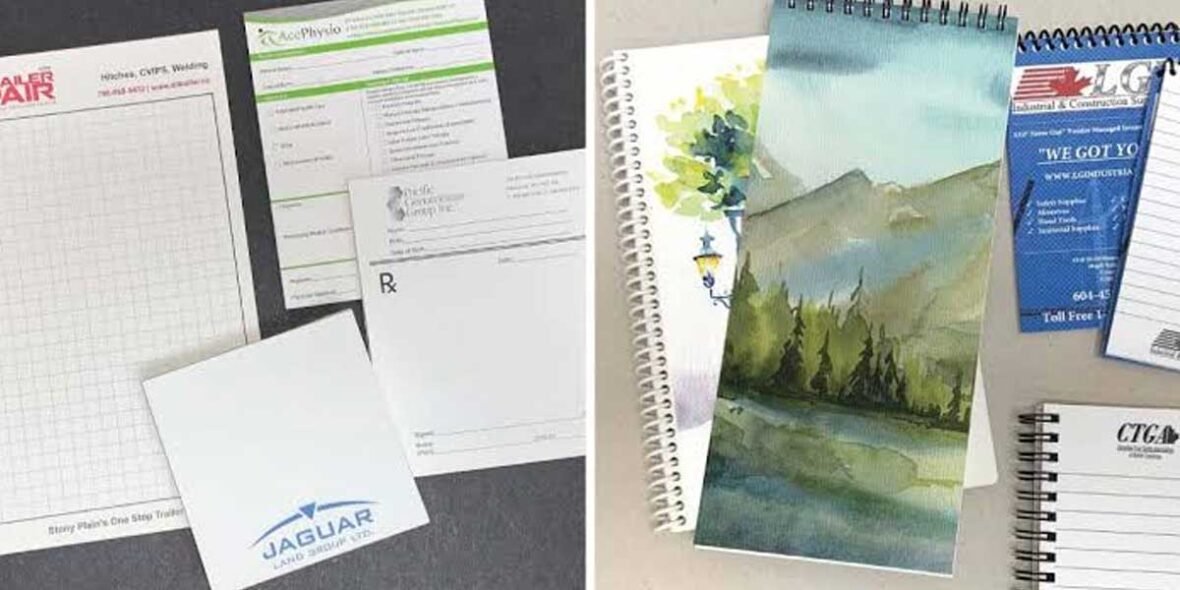
A branded notepad is only as good as the artwork it carries, and this is where a surprising number of orders lose their edge. The pad itself might be a good weight and a sensible size, but if the logo is placed where torn sheets cut it off, or supplied at a resolution that prints soft, the finished item quietly undersells the brand it was meant to promote. The good news is that getting notepad artwork right is straightforward once you know the handful of rules that actually matter.
Those rules are not the same as for a business card or a flyer, because a notepad has a property those do not: it is designed to be torn apart. That single fact drives most of the artwork decisions, and it is worth starting there.
The bound-edge rule
On most notepads the sheets are bound and torn along one edge, which means anything printed near the opposite edge survives use while the branding around the tear can be compromised as sheets come away. The practical rule is to anchor your logo and key details near the bound edge, where they stay intact and legible on every sheet, whole or half-used. It is a small consideration that most templates ignore and that makes a visible difference to how the pad reads after a week of use. Because the bound edge can sit at the top, bottom or side depending on the pad, it is worth confirming the orientation before finalising the layout.
Coverage: how much branding is too much
Notepads can be printed to full coverage, front and back, on every sheet, and the temptation is to fill the space. Resist it. A sheet that looks like a usable piece of paper gets used; a sheet that looks like an advert gets binned. The most effective promotional pads tend to carry clean, restrained branding, often a logo and a single line of contact detail near the bound edge, leaving the rest of the sheet genuinely writable. The branding earns its exposure precisely because the pad is useful, so anything that compromises usefulness is working against you.
That said, the flexibility is real and worth using deliberately. When the branding is well judged, a business benefits from printing on every sheet rather than just the cover, and logo-printed notepads in a choice of print methods give you room to do exactly that, from a single spot colour to full-colour digital print that handles photographs, gradients and detailed artwork. The choice of method depends on your logo as much as your budget, which is the next thing to get right.
Front, back and every sheet
One decision worth making deliberately is how far through the pad the branding runs. It is entirely possible to print only the top sheet, only the backing cover, one side of every sheet, or both sides of every sheet, and each choice has a different cost and a different effect. Printing the logo on every sheet is what gives a notepad its defining advantage over most giveaways: the branding reappears with every torn page, so a single pad delivers the same impression dozens of times as it is used up rather than once. For most promotional pads that repeated exposure is the whole point, and printing every sheet is worth the modest extra over a cover-only pad. The reverse of each sheet is a quieter opportunity too, useful for a calendar, a contact panel or a simple pattern that reinforces the brand without competing with the writing space on the front. The rule is the same as everywhere else on the pad: use the space where it adds something, and leave it clear where clear is more useful.
Spot colour or full colour
For a simple, bold logo in one or two brand colours, screen printing is economical and crisp, and it holds a solid colour beautifully. For anything involving photographs, gradients, shadows or many colours, full-colour digital printing is the method that reproduces it faithfully. Neither is better in general; the right one is dictated by the artwork. A supplier who asks to see your logo before recommending a method is doing the job properly.
Supplying artwork that prints clean
A few habits prevent almost all the common problems. Supply your logo as vector artwork where possible, so it stays sharp at any size. Keep important text and graphics inside the safe area, away from the trim, so nothing critical is lost when the sheets are cut. Check that your brand colours are specified consistently, so what you approve is what prints. And always review the proof carefully before you approve it, because the proof is your last chance to catch a problem before it is multiplied across a whole run. GoPromotional provides an artwork proof for approval as standard, which is exactly the point at which to slow down and check every detail.
None of this is difficult, but it is the difference between a pad that flatters your brand and one that merely carries it. If you would like your artwork checked against these rules before it goes to print, the team can guide you through it.
Sources swept: RESEARCH-NOTEPADS.md (Bucket 4 — logo-near-bound-edge placement rule, coverage/sides, screen vs full-colour digital by artwork, proof-before-approval); notepads blog-landscape survey (US print-house FAQs on safe area / bound-edge, paraphrased, treated as cross-geo production rules only). No US figures. Anchor placed mid-post inside the coverage section, a different position again.